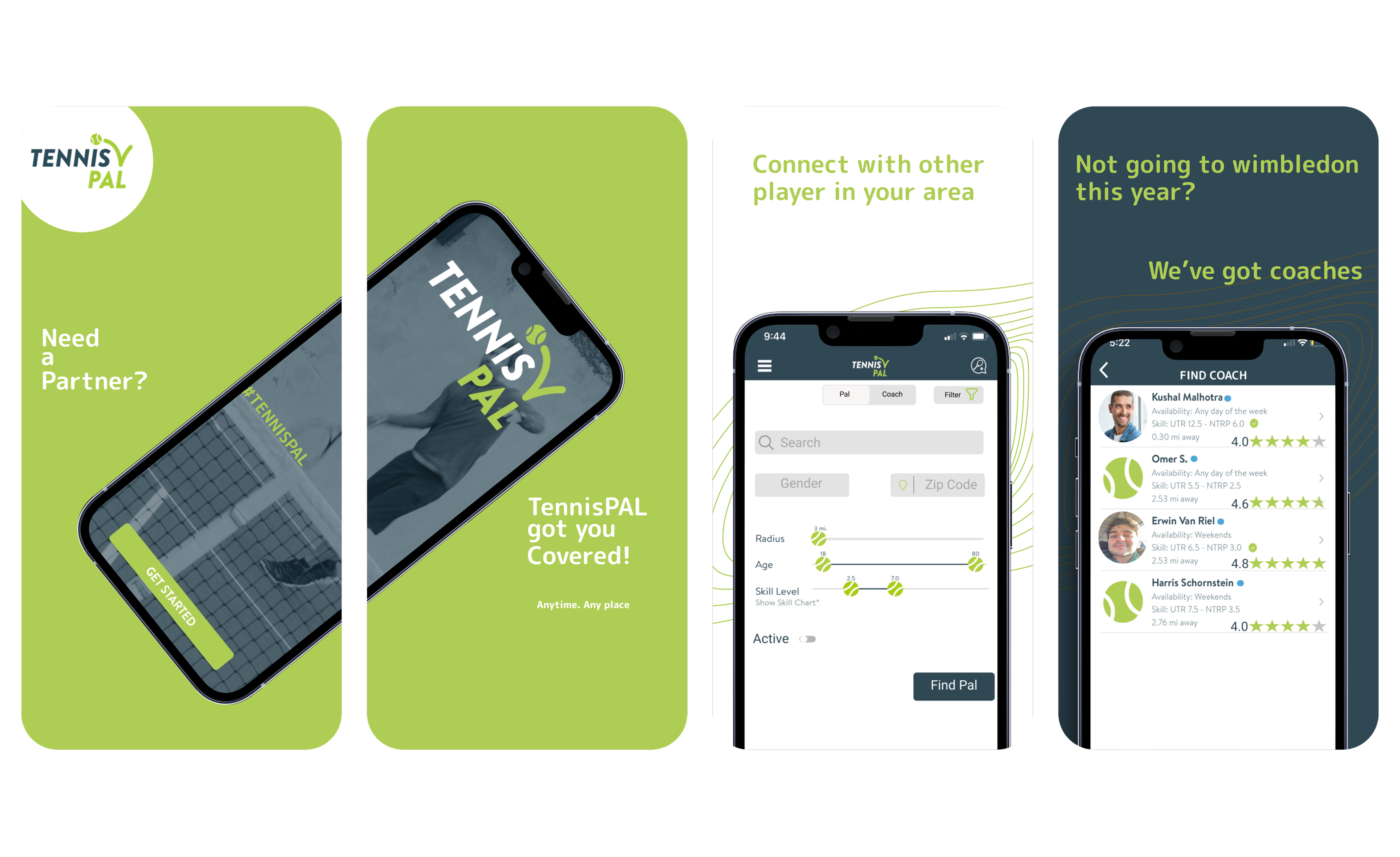
Reducing friction for players who just want to get on court. Contracted by the TennisPAL team to redesign their core discovery flows, reduce drop-off, and help users actually connect with coaches and other players.
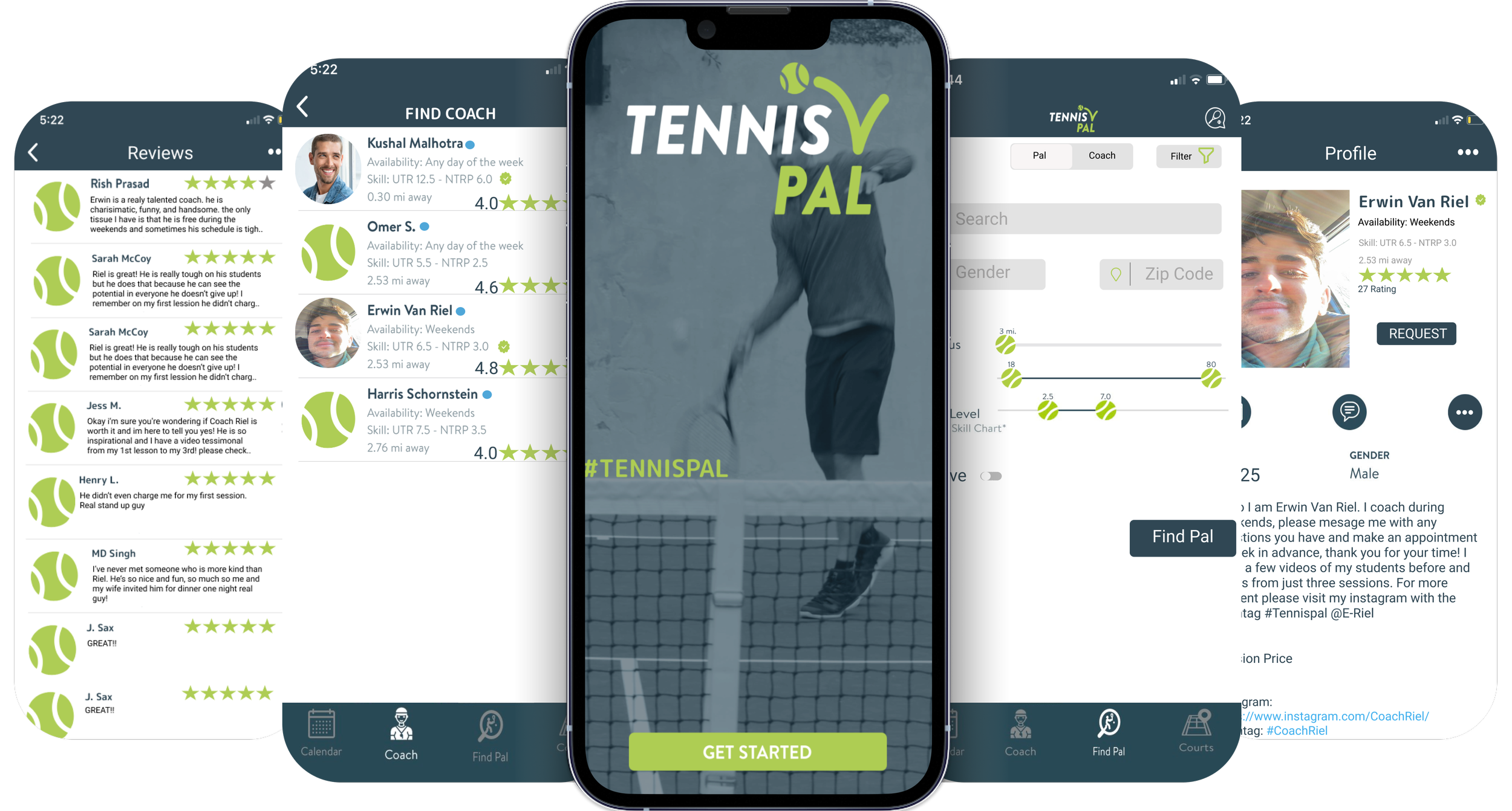
TennisPAL is a tennis community app designed to help users find and book courts, connect with coaches, and play with other players nearby. Users can book games, find coaches in person or virtually, and reserve courts anywhere.
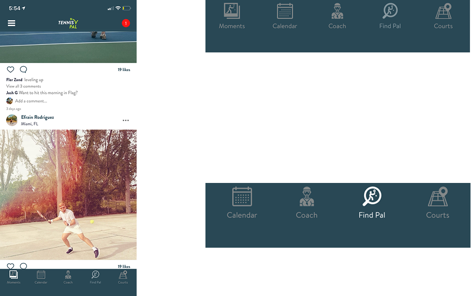
Rather than redesigning a feature users were avoiding, I recommended removing the Moments feed entirely, allowing the TennisPAL team to focus on what was already working.
To understand where users were dropping off, I conducted interviews with active TennisPAL users and reviewed in-app analytics provided by the team. The goal was to identify friction points in the core flows: finding a coach, connecting with other players, and booking courts. Key methods included user interviews with active players and coaches, a heuristic evaluation of the existing app flows, review of in-app drop-off analytics from the TennisPAL team, and a competitive analysis of similar platforms. What became clear was that the problem was not missing features. It was trust and visibility. Users had no way to know if a coach was responsive, no signal of how active another player was, and no way to filter meaningfully. The Moments feed was pulling attention away from the three things users actually came to do.
I used TennisPAL during the pandemic. The core idea was solid -- find courts near you, connect with players, book games, hire coaches. But using it felt like the app was trying to do too many things at once and doing most of them poorly. There was a social feed nobody was using, a calendar that added friction, and a matching feature that felt broken because half the accounts were ghosts. The bones were good. The execution needed surgery.
Data from user interviews and in-app analytics pointed to three root causes: a cluttered Moments feed that distracted from core tasks, too many inactive user profiles surfaced in search, and filtering tools too shallow to be useful. Every redesign decision traces back to these findings.
- — Recently Active Marker
- — Rating System
- — Intuitive Simple Interface
- — More Streamlined Navigation
The social feed and the calendar were both removed. Not because they are bad ideas in the abstract -- but because TennisPAL was already struggling to do its core job well. A focused app that connects players and books courts beats a cluttered app that tries to be Instagram and Google Calendar at the same time. Refinement over expansion.
Nobody feels comfortable spending money on someone they know nothing about. The original coach listings were bare -- a name, maybe a photo. I designed a full coach profile page with a bio, specialties, contact options, and a reviews section. The logic is the same as any service marketplace -- trust is the product. If a user can read three reviews from people who trained with this coach, they book. If they can't, they don't.
The goal of these prototypes was to translate user research insights directly into design improvements. The focus was on refining the app's most-used core interactions, simplifying the experience rather than adding unnecessary features. This included removing the redundant Moments tab, making targeted UI adjustments such as relocating the search icon for better accessibility, and adding filters to streamline user searches. The core belief behind these changes is that TennisPAL should help users quickly connect with players, coaches, and courts, enabling fast, intentional interactions so they can spend less time navigating the app and more time on the court.
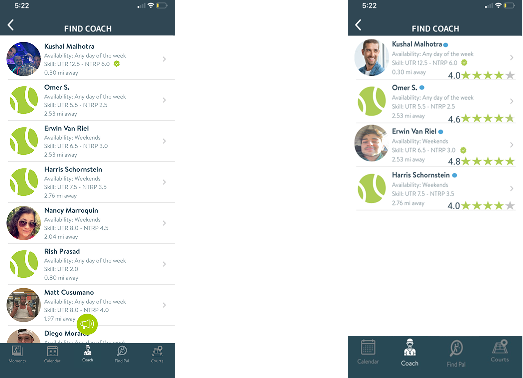
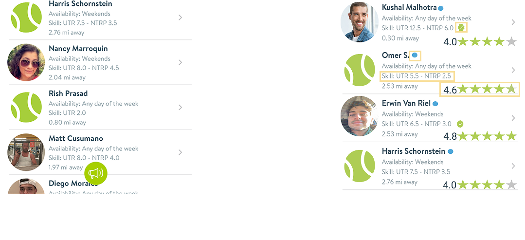
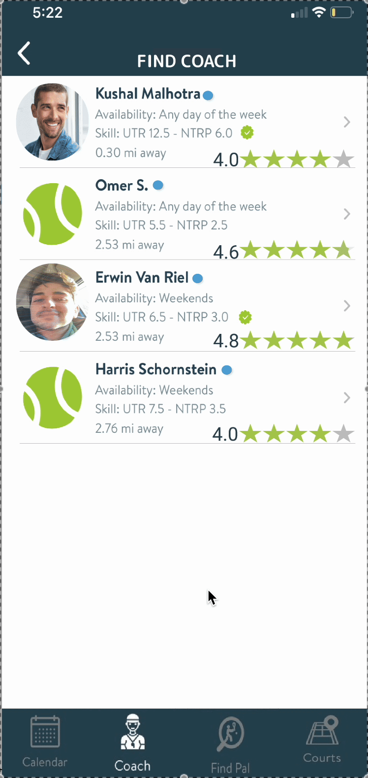
The Find Coaches page was redesigned to foster greater trust and improve usability. A rating system was introduced, allowing users to share feedback on their coaching experiences, helping others feel more confident when booking and find coaches aligned with their learning style. Active indicators were added to show recent activity, addressing a key pain point: many users reported sending messages and receiving no response. This visual cue helps users make more informed choices about whom to contact. Additionally, the removal of the prominent green button at the bottom of the screen created a more intuitive, streamlined interface.
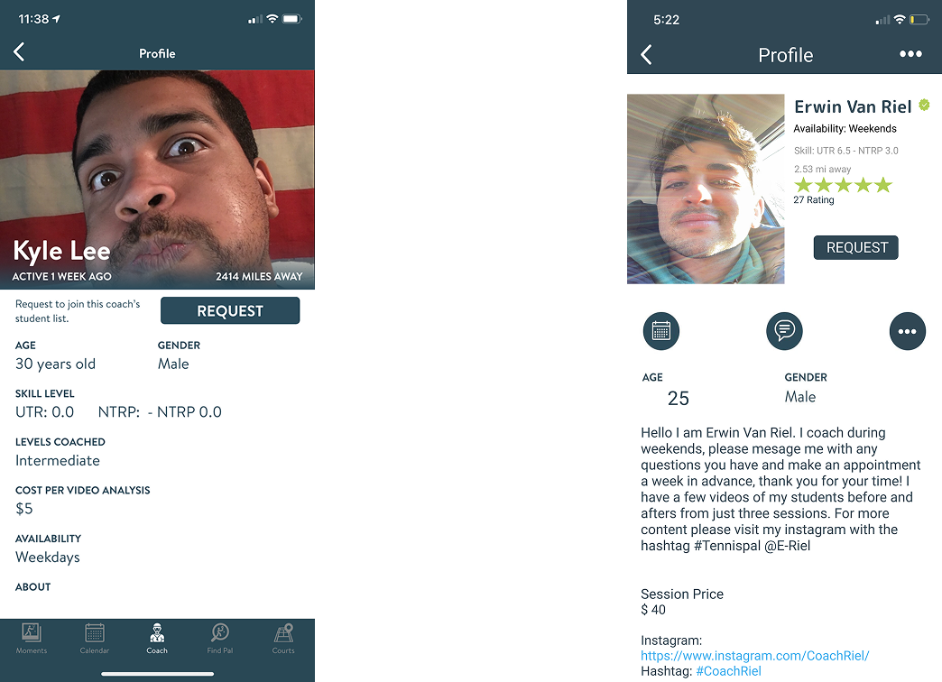
The goal of this redesign was to make the Coach Profile page more trustworthy, intuitive, and user-friendly. Based on user research, I focused on improving information hierarchy and reducing friction in the booking flow. Key changes included adding a rating system and activity indicators to help users feel more confident when selecting a coach, introducing a cleaner layout with clear sections and icons for better readability, and giving coaches space to personalize their profiles with descriptions and social proof. I also removed distracting UI elements like the bottom navigation bar to create a more focused and streamlined experience, ultimately making it easier for users to connect with coaches and book sessions quickly.
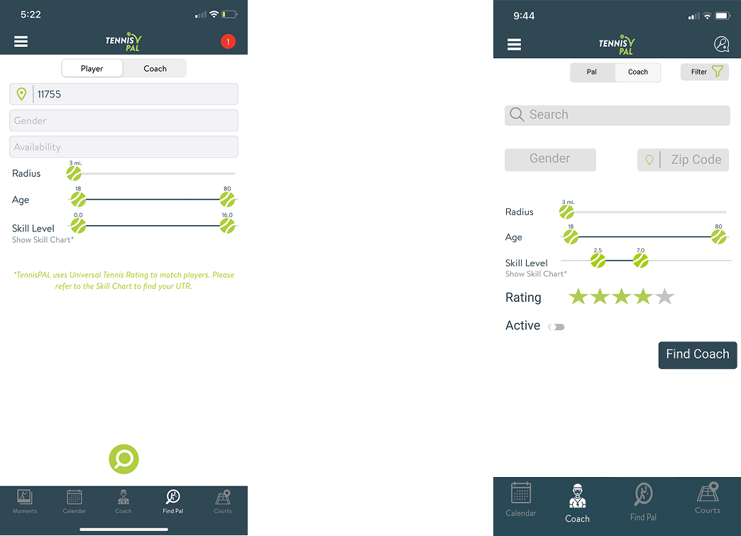
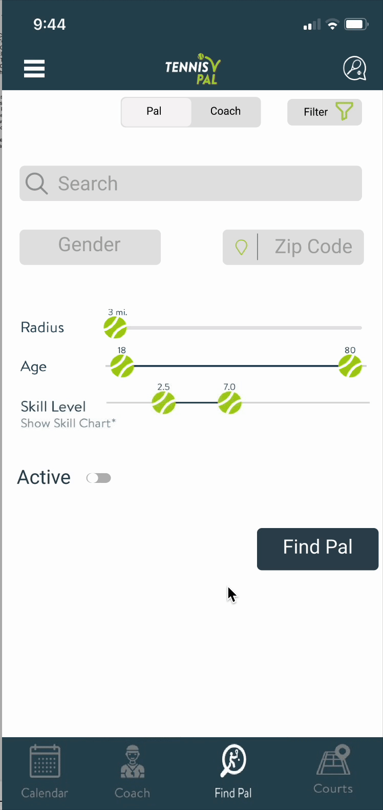
The goal of the Search page redesign was to provide users with more precise and useful filtering options for finding the right match. Key enhancements included adding a rating system, recent activity indicators, distance visibility, and skill level, all essential elements to help users make faster, more informed decisions and create a more streamlined, personalized search experience.
After testing the redesigned flows with the original user group, retention and task completion increased by 30%. Users who had previously given up searching for coaches citing inactive profiles and no trust signals successfully booked sessions once the rating system and activity indicators were live. Removing the Moments feed eliminated the primary source of navigation confusion and redirected users toward the core value of the app: finding players, booking coaches, and getting on the court.
The primary goal was to retain and refine TennisPAL's core functionality. By removing the Moments feed and focusing on what users actually valued, finding coaches, connecting with players, booking courts, the experience became more intuitive and actionable.
Active status indicators, skill level rankings, coach ratings, and advanced filters all serve one purpose: help users spend less time navigating the app and more time on the court.
This project reinforced something I think about often: the best product decisions are sometimes subtractive. Removing the Moments feed was a harder sell than adding a new feature, but it was the right call for the product. If I were to revisit this work I would push for more longitudinal data after launch rather than just post-test results. I would also have explored coach-side onboarding improvements since a better rated coach pool directly impacts how much trust the rating system can actually build. The 3-month timeline was tight. Prioritizing ruthlessly and knowing which UX wins would have the highest impact with the least disruption to the existing product was the most valuable skill this project sharpened.
The activity indicator solved the symptom. The real problem is account quality -- an app is only as good as its active user base. If I were taking this further I'd think harder about onboarding and re-engagement, not just signaling who is active to users who are already there.