Streamlining the user experience of navigating FAFSA for first-generation college students.
To understand UnderstandingFAFSA, we need to understand FAFSA itself. Free Application for Federal Student Aid is a form completed by current and prospective college students in the United States to determine their eligibility for student financial aid. UnderstandingFAFSA.org is a dedicated website and extended resource hub created to support students and families navigating the FAFSA process.
Most students who apply for FAFSA come from very diverse backgrounds. Some students grow up in two-parent households, others are raised by grandparents or parents who are divorced, or some students grow up with parents who don't know English. Many different circumstances exist, the rules of FAFSA change often, and it may be hard to find one source that makes it easier for students to follow. UnderstandingFAFSA makes finding the resources easier for their users.
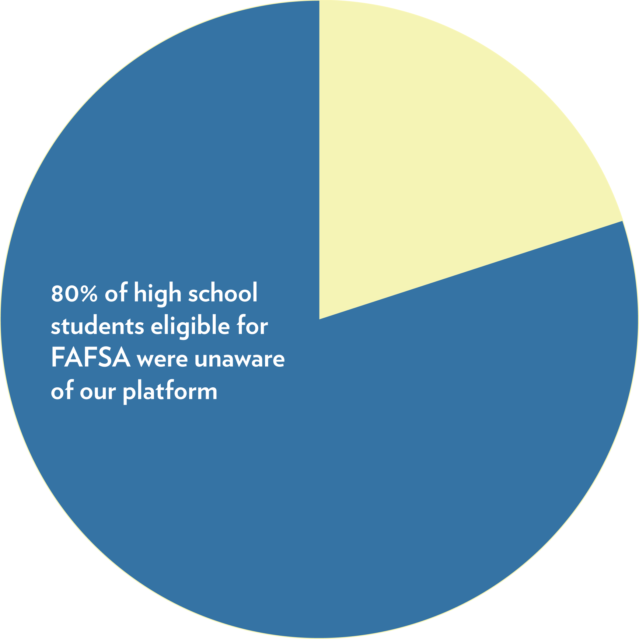
In terms of analytics, we were not hitting the numbers that we wanted to. We also wanted to do interviews to understand where we as an organization could improve, so we conducted user research with many first-generation Americans and first-generation college attendees. We conducted research with 120 students, and the results were fascinating.
We discovered that 80% of high school students eligible for FAFSA were unaware of our platform, a significant gap in outreach and impact.
Among those who did use the platform, 58% reported frustration when trying to find specific resources like articles, videos, or topic-based guides. Many users either turned to other websites or abandoned the search altogether.
To me, this signaled a clear opportunity: improve the user journey by making resource discovery easier and more intuitive.


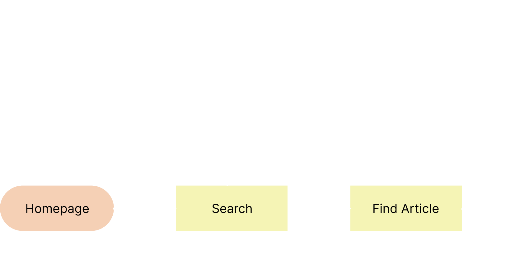
Understanding the issues with the current experience, my goal was to create tags on every article where users can be brought to a pool of related articles and resources. Here is the redesigned experience I aimed to create.
The original sitemap forced users to repeat the same navigation paths, creating friction and increasing the likelihood of drop-off.
The redesigned sitemap introduces topic-based tags that help users discover related content more efficiently, reducing repetition and creating a more streamlined experience.
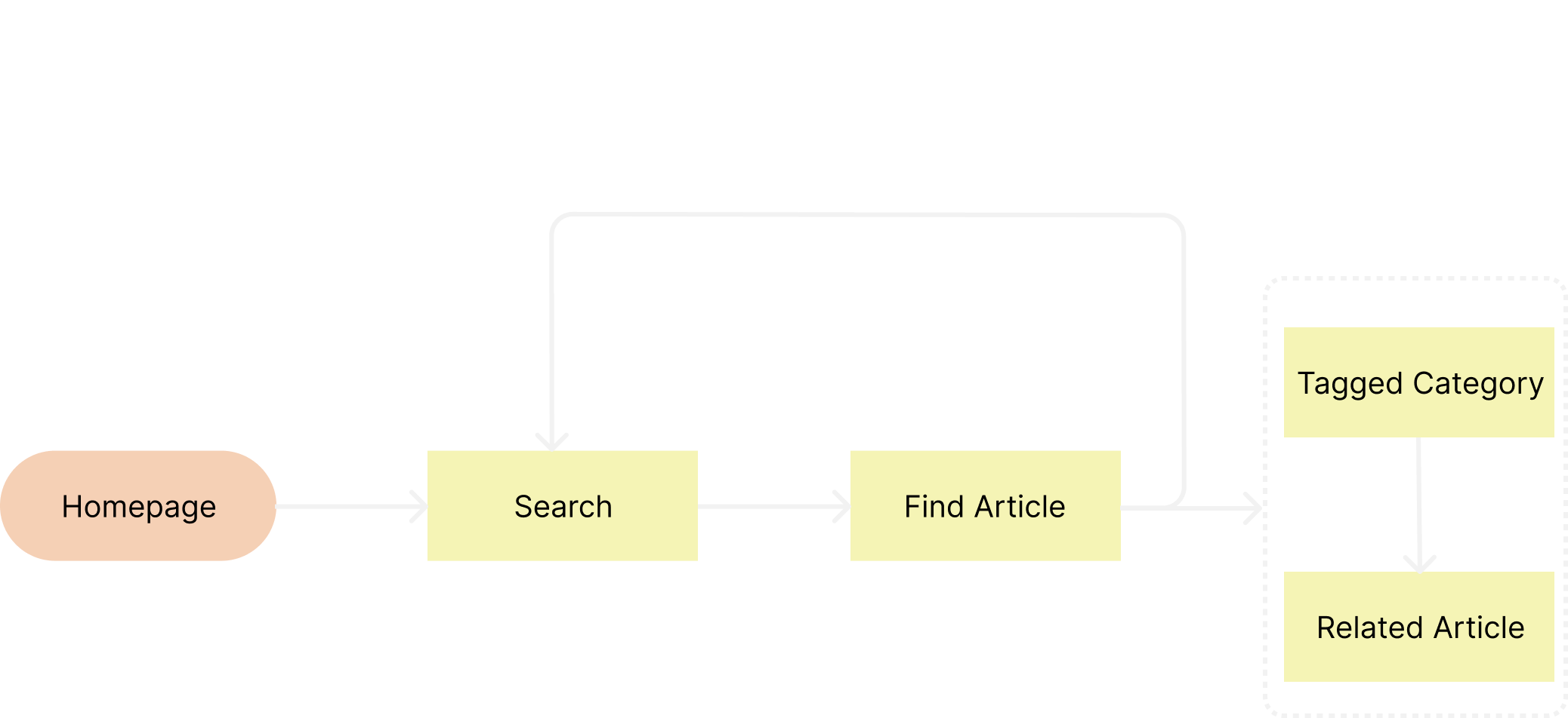

Allows for users to find more on topic.
Based on analytics patterns and observed user behavior, the site appeared to maintain steady but fragile traffic, with users arriving consistently but struggling to move efficiently through content.
While top-of-funnel traffic was present, repetitive navigation paths and limited content discovery created friction that likely contributed to higher bounce rates and early exits, preventing sustained engagement or growth.
The sitemap redesign focused on improving content discoverability and flow, increasing the likelihood that existing traffic would convert into deeper sessions rather than drop off.