Brand identity and website design for Jones + Poet, an interior design studio.
SERVICES
Brand Identity · Web Design · Development
ROLE
Product Designer, Contract
Scroll
Task At Hand
Jones + Poet came to me needing a full identity, brand direction, and a website that read editorial and high end without feeling cold. Their pitch was an iconoclastic take on interior design: warm, personable, almost maternal, the opposite of the sterile portfolio sites the category defaults to.
Brand Direction
Principles
01
Editorial layout over gallery-grid convention. Every project reads like a magazine feature, not a listing.
02
A monogram built from two interlocking letterforms, J and P, registered so precisely they read as one mark instead of two initials side by side.
03
High-end without being cold: warm neutral tones, generous whitespace, a personable, almost maternal voice in the copy.
04
An iconoclastic stance against the category's sameness. Most interior design sites default to minimal to the point of anonymous, this one has a point of view.
On Black

On White

The Intro
The site opens on black. The J drops in from above, the P rises from below, and they land registered against each other with pixel-level precision, so the two letterforms interlock into a single monogram rather than reading as two separate initials.
Build Detail
01
The J drops in from above on a translateY(-80px) entrance, the P rises from below on translateY(80px). Both ease on the same cubic-bezier(0.22, 1, 0.36, 1) so they land on the same beat.
02
Overlap registration is exact: the P's bounding box begins 71.08px right and 56.5px down inside the J's 100.24 × 180.43 frame. That offset is what makes the two letterforms interlock into a single monogram rather than sitting apart.
03
Once settled, the monogram shrinks and docks into the nav corner, then the whole page inverts color together, black backdrop to white, white mark to black.
Scroll into view to replay
J, isolated

P, isolated

Two Color Modes
The monogram exists as exactly one file. Everything else is a CSS filter. On the black intro it renders at full brightness, true white. Once it docks into the nav on the white site, it flips to zero brightness, true black. Same asset, same shape, the color does all the work of announcing you've arrived.
Intro

Docked
The Work
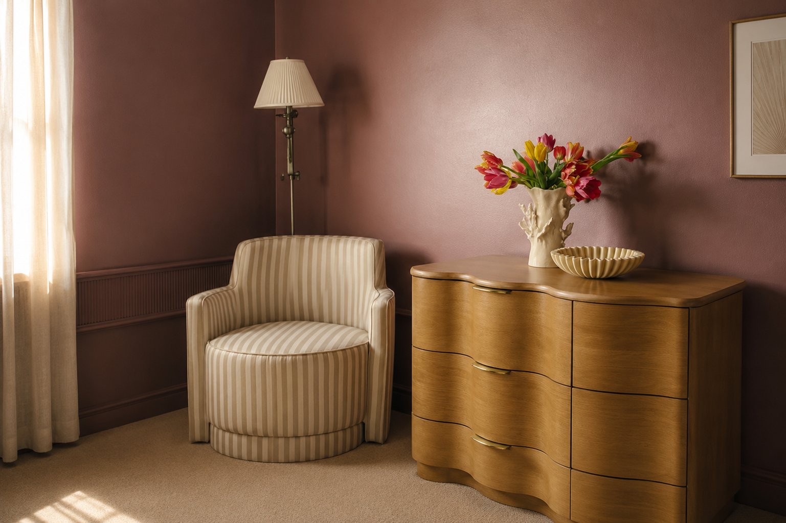
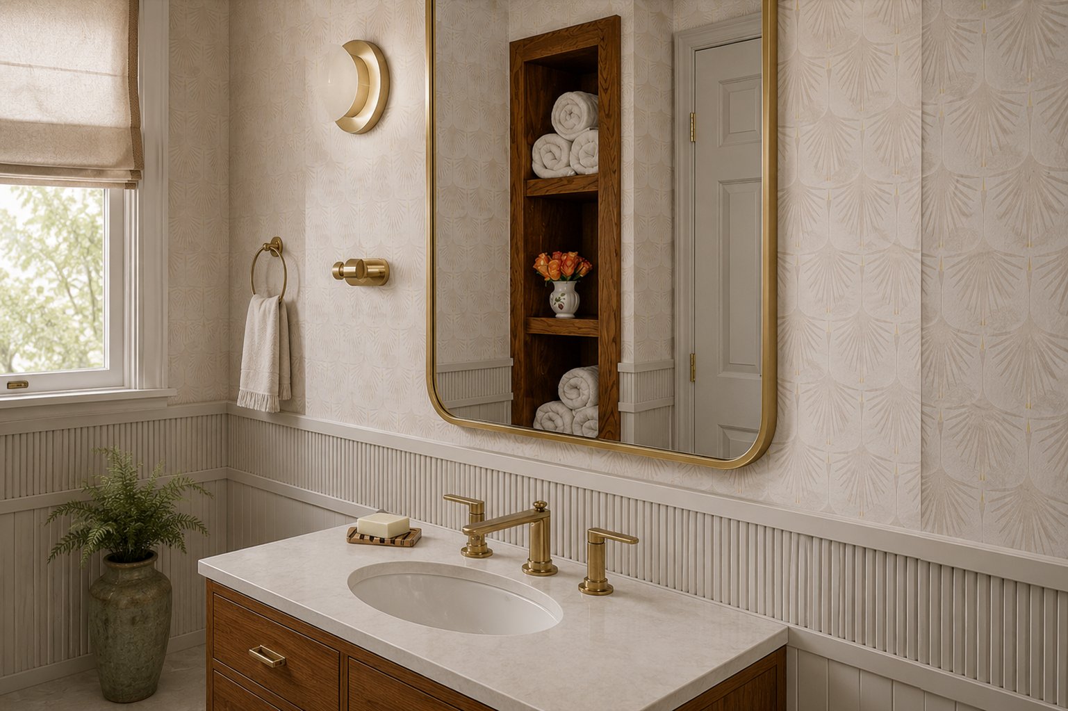
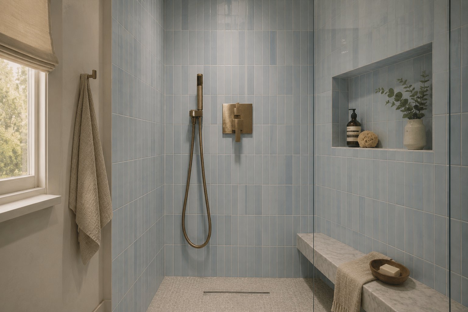
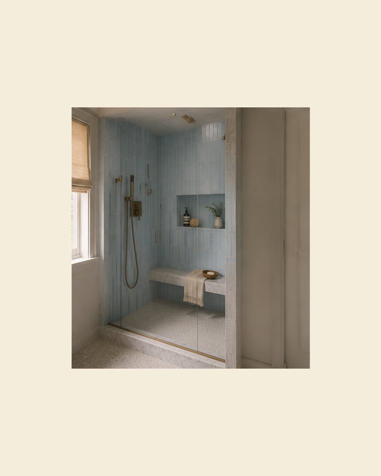
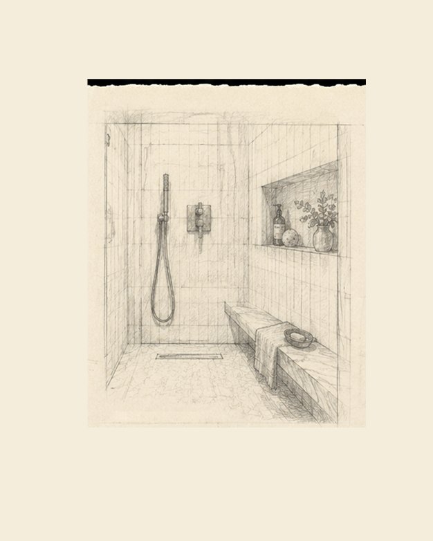
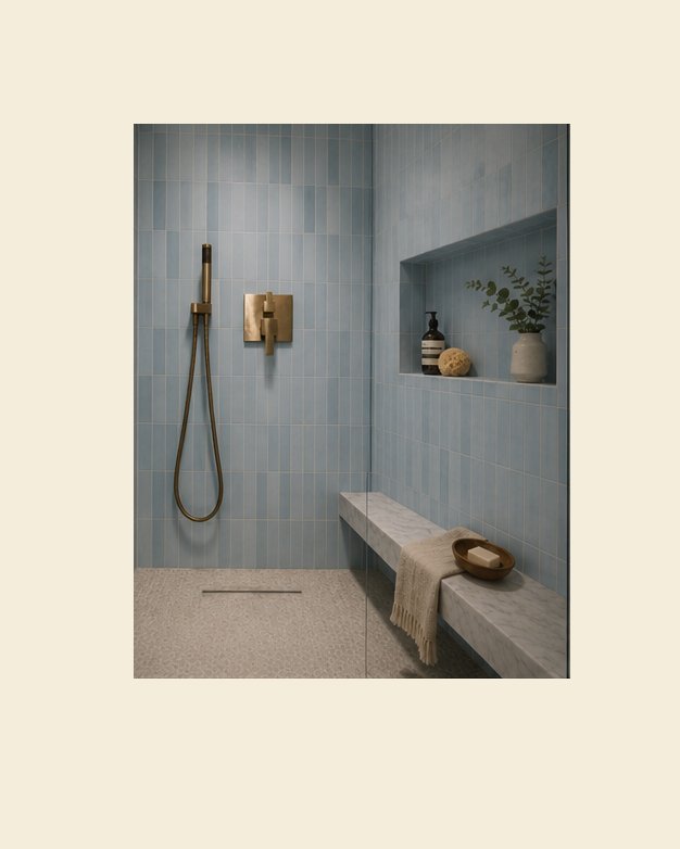
The homepage is the portfolio. Three interior photographs sit side by side as a triptych of the studio's real projects, Maple House, Harbor Loft, and Birch Residence, so the work is the first thing you see, not a description of it.
Birch Residence, In Detail
01
Type: Residential — Program: Interior Design
02
Location: Milwaukee, WI — Year: 2023
03
Area: 300 sq ft — Client: Private Residence